| Entrance | Mainstreet | Wiki | Register |
|
# of watchers: 13
| D20: 8 |
| Wiki-page rating |  Stumble! Stumble! |
| Informative: | 0 |
| Artistic: | 0 |
| Funny-rating: | 0 |
| Friendly: | 0 |


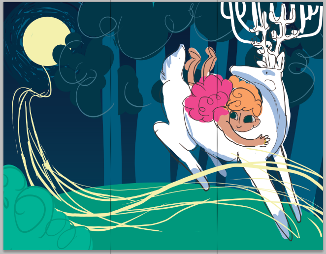
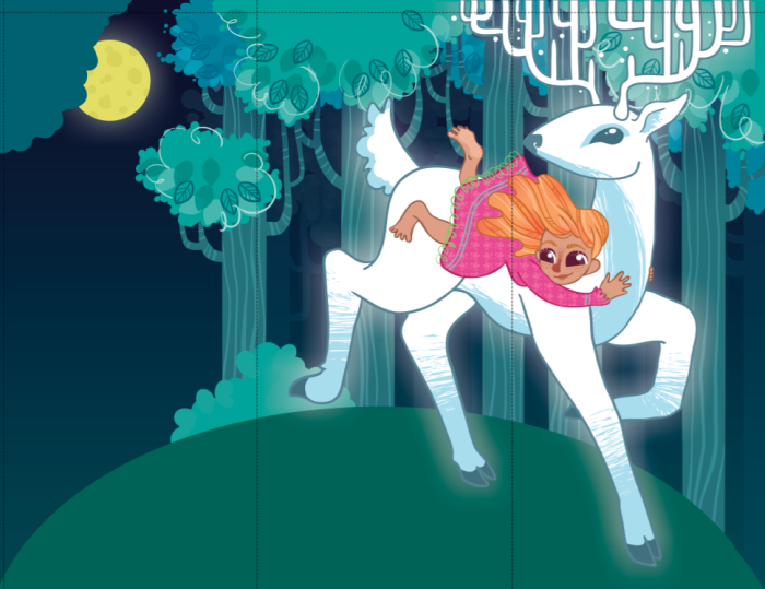
2010-04-22 [NOOOPE]: AH! I just wrote you this big comment about how they look too much like flappers, not noticing that was the point... I feel stupid.
And I like the last one, but, uh, too late.
2010-04-23 [Daisy_Sandybanks]: Oh, I love it!
I love the colors, very vibrant.
2010-04-23 [Chel.]: What aspects do you like? This is really just a rough. I can change it in the real composition.
2010-04-23 [NOOOPE]: What do I like? With the last one, I feel the flapper element doesn't take over. With the ones on the left, flapper is the first thing I saw. With the last one it's there, but it's subtle. Plus, she has a very adorable expression. Very playful.
2010-04-23 [Chel.]: I thought the last one almost gave out a "Egyptian" vibe....
2010-04-26 [pegasus1000]: I like the color and costumes. They are very nice and playful. In the full body pic It looks like her hand is as big as her head (Kinda odd to me). Do you have full body shots of all four? It would be nice to see.
2010-05-06 [Daisy_Sandybanks]: I love them!
Very colorful and bright. Would definitely get the customer attention.
Why do the Lemon Chalet ones have a praying mantis on the back though? I hope they're not made out of them. ;)
2010-05-06 [Chel.]: Haha! XD
2010-05-06 [NOOOPE]: Freakin sweet. Awesomely professional and adorable
2010-05-07 [pegasus1000]: Makes me smile looking at them.
2010-05-07 [Chel.]: What happened to the feedback? I know I'm not that amazing.
2010-05-07 [NOOOPE]: What? We're allowed to just say we like 'em if we can't find any fault with them. This isn't a critique wiki. If we feel it's necessary to critique, then we can, but if we don't, then we're not obligated to. Saying we like it IS feedback.
2010-05-08 [Chel.]: Yea- I suppose.
But I do think there is never something not to crit.
2010-05-11 [pegasus1000]: If you insist. I wish you had kept the large pics of the cookies on the front of the box. Girl Scout cookies are usually placed on tables when sold. If you are trying to get a new customer that person will want to see the cookies. Even Returning customers are drawn to their beloved cookies and ignore the rest. To me one cookie is NEVER enough.
Where is the Girl Scout motto? Courage Confidence Character
2010-05-11 [Chel.]: Motto and cookie is on the side.
To counter that, my whole thing was that the current boxes seem to be all about the cookies. Which really isn't the important thing. Sure they are delicious- but that shouldn't be the real reason to buy from a girl scout.
My boxes are more about what the profits go towards and not so much about the cookies. Each box has written on the back where the money goes to. "The profits made from this box goes towards teaching girls nutrition..." etc etc
2010-05-12 [pegasus1000]: Think of it in cereal terms. You always see pictures of the cereal, even Shredded Wheat. I think the only exception would be Wheaties. Shoppers want to see the product on the front the back of the box is for other material (Games, what the product goes to and so on.)
You do have shelf appeal. Yes your boxes are cute and tell people what the funds go to, (I would bye it, Major props) but you give me one cookie and it is on the side. It is the one thing I had grief with.
2010-05-12 [Chel.]: Interesting... Thanks a lot!
2010-05-17 [arthemis_]: Oh I do adore the design, very comic/tv-showl
2010-05-20 [The Dizzy Raven]: haha!!! :D i love it!!! not many artists these days do designs like that. :) *thumbs up*
2010-05-20 [Falx]: Okay, now there are some girl scout cookie boxes I wouldn't have minded shoving off on a few people. I think the best part about this is how the designs look like something little kids should be selling. The cartoonish quality is really very sweet.
2010-06-10 [Chel.]: New.
| Show these comments on your site |
|
Elftown - Wiki, forums, community and friendship.
|